A Seattle Tudor Gets a Modern Refresh
Lifestyle
Interview with Emily Ruff
Photography by Carina Skrobecki Photo
Lifestyle When transplants to Seattle’s historic Laurelhurst neighborhood approached seasoned designer Emily Ruff, they faced an aesthetic challenge: how to update an aging Tudor manor with practical features for a growing, sociable family while also preserving its traditional charm.
Ruff shares her journey of imbuing the home with pristine style.
Tell us about your design background:
I started my design business as a side hustle while doing advertising for Amazon. I only took on a few projects at a time. But once I had my daughter in 2019, I decided to go on maternity leave and never go back. I moved to design full-time in the summer of 2020 and have been busy ever since. I tend to be inspired by designers who mix styles; Emily Henderson and Kelly Wearstler come to mind. I don’t really resonate with one specific look. Instead, I like to combine new pieces with vintage ones to create what I call a “collected and curated aesthetic.” These designs feel more unique than cookie-cutter.
Would you give us an overview of this project?
The home is located in Laurelhurst, a waterfront neighborhood in Seattle. The clients moved from Washington, DC, to Seattle and wanted a home where they could entertain new friends in the neighborhood and host family from out of town. So entertaining was top of mind. The wife drove most of the design; she definitely has a great eye.
The home they purchased has a beautiful Tudor exterior full of detailed character, which I wanted to be sure to carry into the indoors too. However, it hadn’t been updated since the ’80s. On the second floor, there was carpet everywhere, even in the bathroom, so we removed it to restore the original hardwood floors underneath.
What was the most dramatic overhaul?
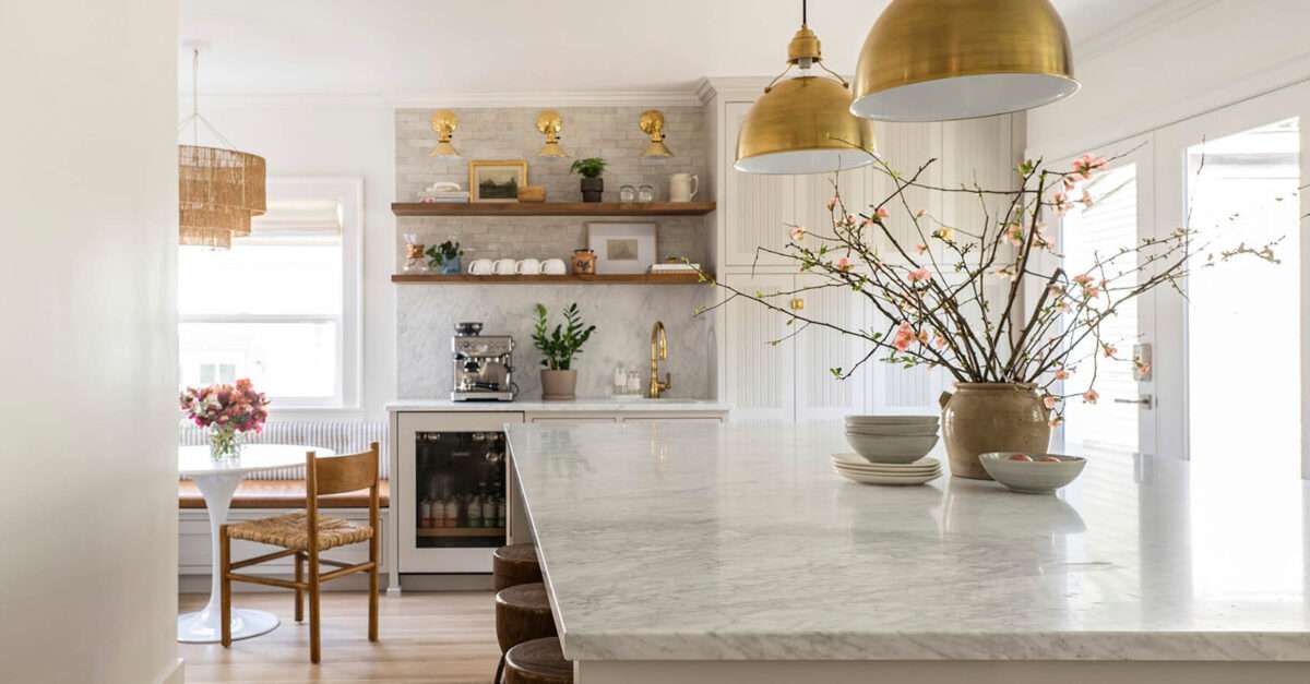
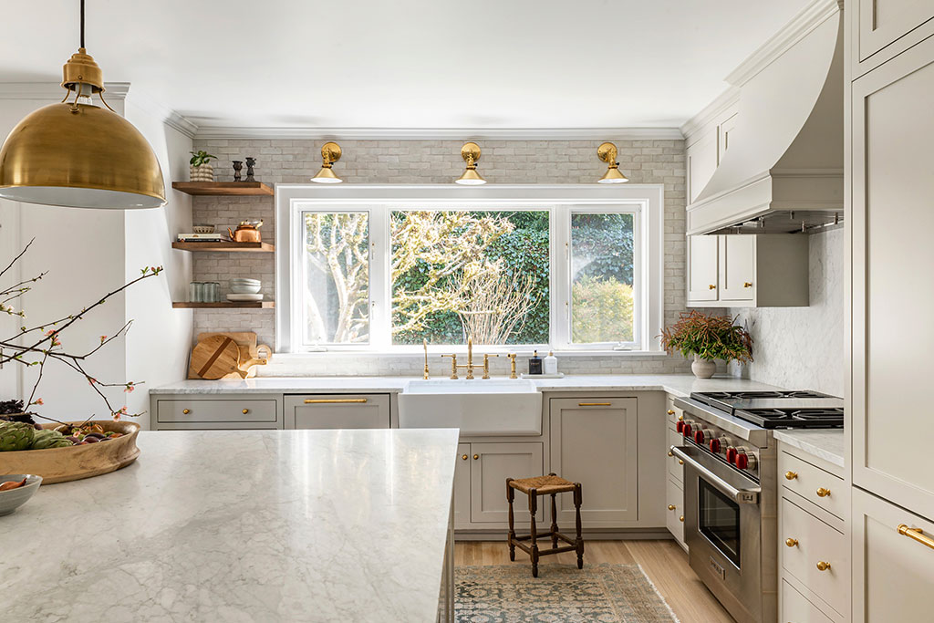
The kitchen was outdated, and the layout was very odd. It was long with multiple entry points and had a structural beam and post that obstructed views inside the room and limited the cabinetry arrangement. Meanwhile, the range was in a strange peninsula. We ended up replacing the beam and post with a twenty-foot steel beam inside the ceiling, which opened up the layout and made space for an island. That was probably the biggest challenge since we had to carry supplies up quite a few stairs to get to the front door.
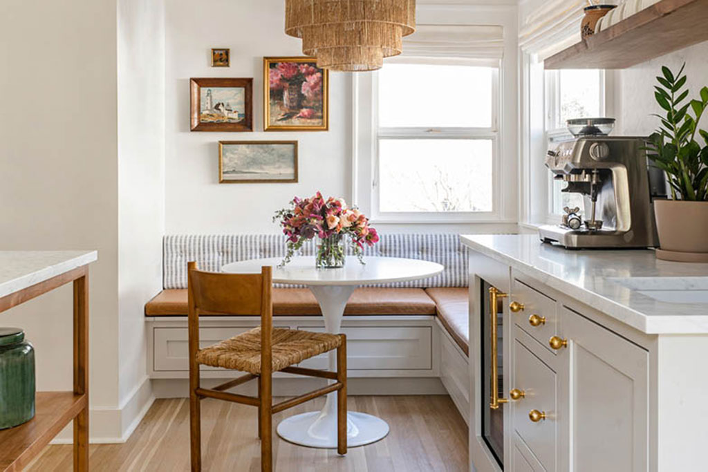
On the main list of things the clients wanted for their kitchen was a coffee bar, which the husband was especially passionate about. They’re big into espresso and brew it multiple times a day, so they wanted a dedicated space with a beverage refrigerator and room for coffee supplies.
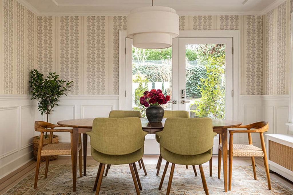
The wife requested that it be separate from the rest of the kitchen to make it easy for her to cook while her husband made coffee. Since I couldn’t free up space they didn’t have before, we installed a cabinet pantry to make room for both the bar and a breakfast nook. That nook was another item on their must-have list because they don’t use their formal dining room very often. It was originally a big seating area with oversized cabinets and had only one window and a single door going out to the backyard, which we changed to glass double doors. We also added shelf inlets by the nook and placed the sink in a jutted-out section.
In all the other spaces throughout the home, we kept the layouts generally the same. We resized the bathtub and shower areas, but the kitchen was the most dramatic change. Improving kitchen layouts is one of my favorite parts of being a designer. I had to figure out how to fit in everything they wanted while making it functional and aesthetically pleasing.
Did they list any other must-haves?
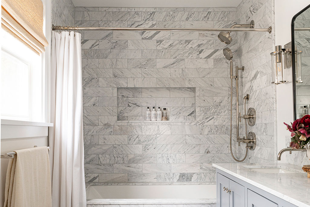
The wife was pregnant with their first child, so safety was an essential consideration. The kitchen island, for example, is very large with seating on the opposite side of the range, so the clients’ kids will be able to sit far out of reach of hot surfaces on the food-prep side. With the bathrooms, I focused on making them more functional.
We added a tub to the primary one at the clients’ request. In the secondary bath, there was no room for linen storage because there’s actually a laundry closet inside that room, so we added cabinets and hampers under the sinks. We modernized the tile as well. We also updated the basement to add a kitchenette. This area would become a dual playroom space and guest bedroom, so when people come and stay, they will have a little kitchen space of their own. Now the owners have three floors of living space.
How did you approach the bedrooms?
When designing bedrooms, I always ask clients how they want the space to feel. Some clients want a darker, cozier space while others want something bright, light, and super neutral. My clients have very busy and demanding jobs, so the goal in the primary bedroom was to make it as calm and peaceful as possible. The husband had already ordered a custom walnut-toned bed from Denmark, which left me to create a built-in bench and add finishing touches like gray-green nightstands, modern sconces, and a neutral vintage rug for a soothing visual balance.
Were there any conflicts between what the clients requested and your experienced eye?
I think my clients had a pretty clear vision. I won’t say that I had full creative freedom on this project because the wife knew what she liked, but she gave her input up front and let me take it from there, so it was a good partnership. I begin my design process by onboarding clients. During this initial interview, we work together to create a Pinterest board with inspirational images for each space. This is one of the only projects I’ve ever had in which I loved every single inspirational image the clients saved. There was a really good aesthetic fit between us, which doesn’t always happen.
The main challenge was incorporating different styles that they liked, including beachy, coastal, and midcentury modern, with a traditional Tudor home. Blending all of those without feeling disjointed was complex. I wanted to avoid a disconnect between the facade of the home and what’s inside.
How do you approach balancing traditional elements with newer pieces?
One of my favorite places to start with clients, especially ones that are a little bit nervous about using vintage pieces, is with natural, handmade rugs. I also incorporate vintage accessories like the stools in this home’s kitchen and the accents that decorate its shelves. And I always advise when working with wooden elements to limit them to two to three different tones per room for balance.
In general, I prefer to streamline and simplify the larger materials and furniture and then go a little more old-fashioned and ornate with the smaller accessories. Designing in this way keeps interiors from feeling sterile and makes them feel homey.
For more info, visit cohesivelycurated.com
Lifestyle 33 Views
You may also like:
Discover more from Tamfis Nigeria Lmited
Subscribe to get the latest posts sent to your email.


 Hot Deals
 Shopfinish
 Shop
Shop Appliances
 Babies & Kids
 Best Selling
 Books
Books Consumer Electronics
 Furniture
 Home & Kitchen
 Jewelry
 Luxury & Beauty
 Shoes
Shoes Training & Certifications
 Wears & Clothings
